Logo & Icon Design


Package & Label Design
Case Study: Mount Airy Candle Co. Full Branding Package Logo, Label, and Icon
Client: Mount Airy Candle Co.
Role: Creative Director, Graphic Designer,
Deliverables: Logo, Icons, Labels, Branding Guidelines
Tools Used: Photoshop, Illustrator, Photoshop, Indesign
Project Overview:
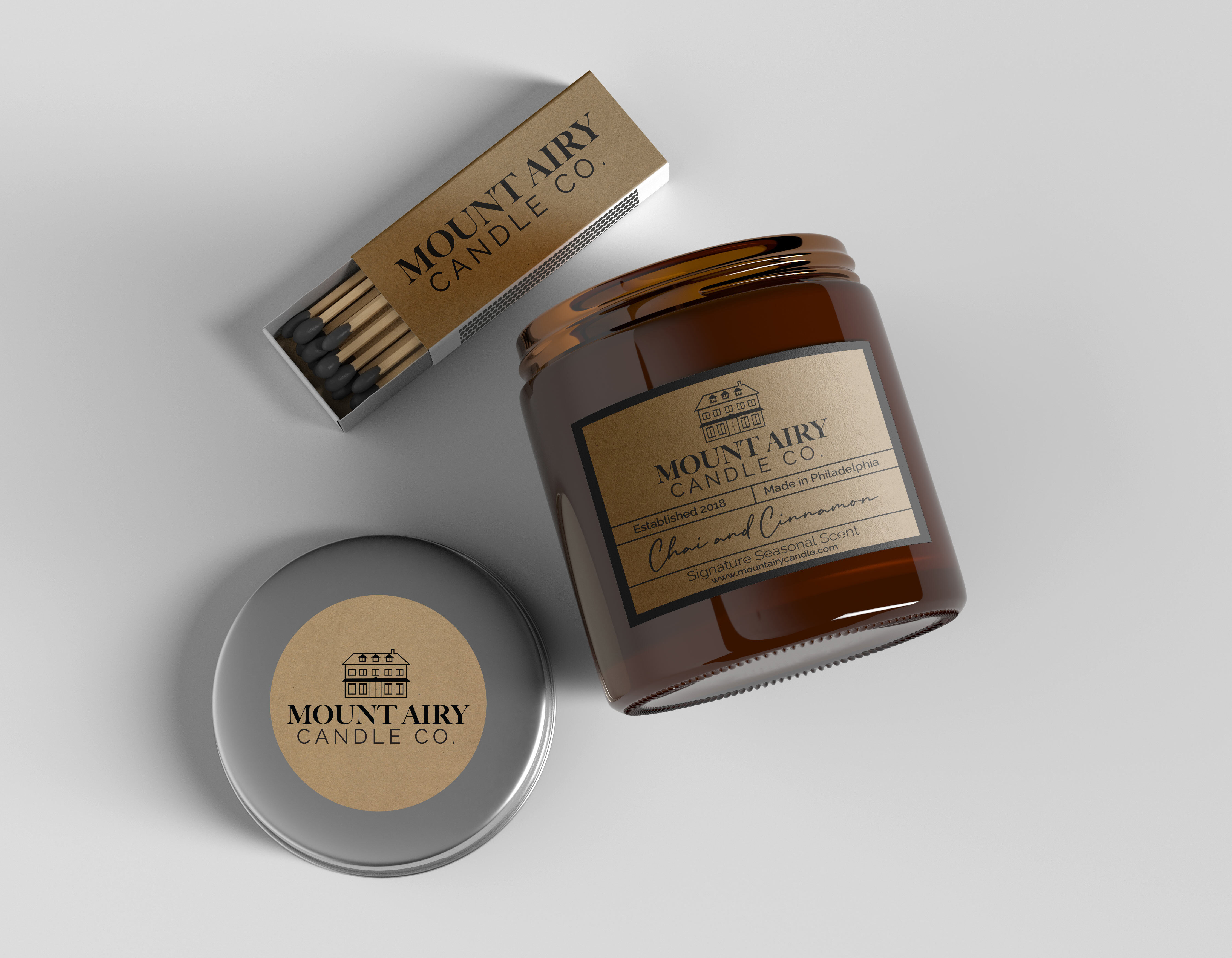
Mount Airy Candle Co., a boutique candle brand, needed a label design that would reflect the company’s artisanal quality and local roots in Philadelphia, PA. The goal was to create a visual identity that resonated with the brand's ethos of handcrafted quality and simple elegance. As the Lead Designer, I was responsible for creating the color scheme, logo, icons, and labels that would be used across their product line.
Challenges:
Brand Identity: The label design needed to convey a sense of warmth, tradition, and quality, while also standing out in the competitive home fragrance market.
Visual Cohesion: Ensuring that the color scheme, logo, icons, and typography worked together harmoniously to create a unified and recognizable brand identity.
Market Appeal: The label had to appeal to a wide range of customers, from local residents to visitors, reflecting the brand’s connection to the Mount Airy community.
Solutions:
Sophisticated Color Scheme:
- I selected a muted, earthy color palette with tones that evoke a natural, calming atmosphere. The choice of kraft paper texture for the label background provided a rustic, handcrafted feel that aligns with the brand’s artisanal approach.
Custom Logo and Iconography:
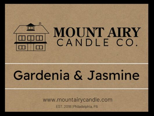
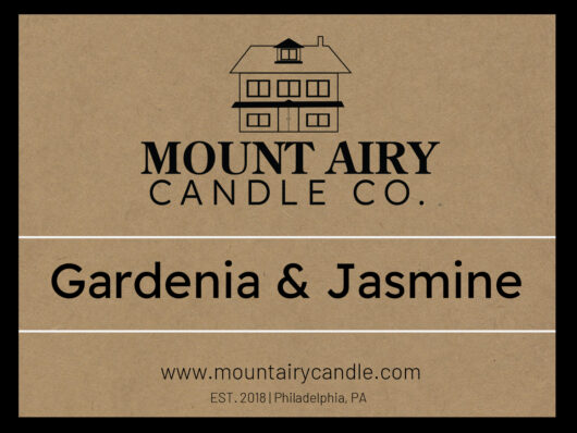
- I designed a logo featuring an illustration of a classic Philadelphia-style house, symbolizing the brand’s roots and connection to the local community. The clean, minimalist line art of the house added a touch of elegance while remaining approachable.
- The typography was chosen to be bold yet simple, ensuring that the brand name “Mount Airy Candle Co.” is clear and prominent. The use of a classic serif font for the brand name complemented the traditional feel of the logo.
Label Design:
- The label was designed with a clean and organized layout, making it easy for customers to read the product name and other essential information at a glance. The use of horizontal lines helped to separate different sections of the label, adding to its overall structure and readability.
- The product name, “Gardenia & Jasmine,” was given ample space and prominence, with a focus on clarity and elegance, enhancing the label’s overall visual appeal.
Results:
Strong Brand Identity: The final label design successfully captured the essence of Mount Airy Candle Co., reflecting its commitment to quality, tradition, and community. The cohesive design elements—color scheme, logo, and typography—created a strong, recognizable brand identity.
Market Differentiation: The sophisticated yet simple design of the labels helped the products stand out on shelves, attracting customers with their understated elegance and connection to local heritage.
Positive Feedback: The design received positive feedback from both the client and customers, who appreciated the blend of traditional and modern elements, as well as the clear and attractive presentation of the product information.
Conclusion:
The logo and label design for Mount Airy Candle Co. is a testament to the power of thoughtful design in building a brand’s identity and market presence. As the Lead Designer, I was able to create a label that not only looks visually appealing but also tells the story of the brand’s roots and values. This project highlights my ability to develop cohesive visual identities that resonate with both the client’s vision and the target audience.


